Chromatic Muse — Nine-Color Eyeshadow Palette in a Butter-Yellow Case Inspired by Sunset and City Lights
Chromatic Muse — Nine-Color Eyeshadow Palette in a Butter-Yellow Case Inspired by Sunset and City Lights
Couldn't load pickup availability

Chromatic Muse — Nine-Color Eyeshadow Palette in a Butter-Yellow Case Inspired by Sunset and City Lights
🎨 Chromatic Muse — Explore Nine Colors, Three Families, and More Than One Way to Build a Look
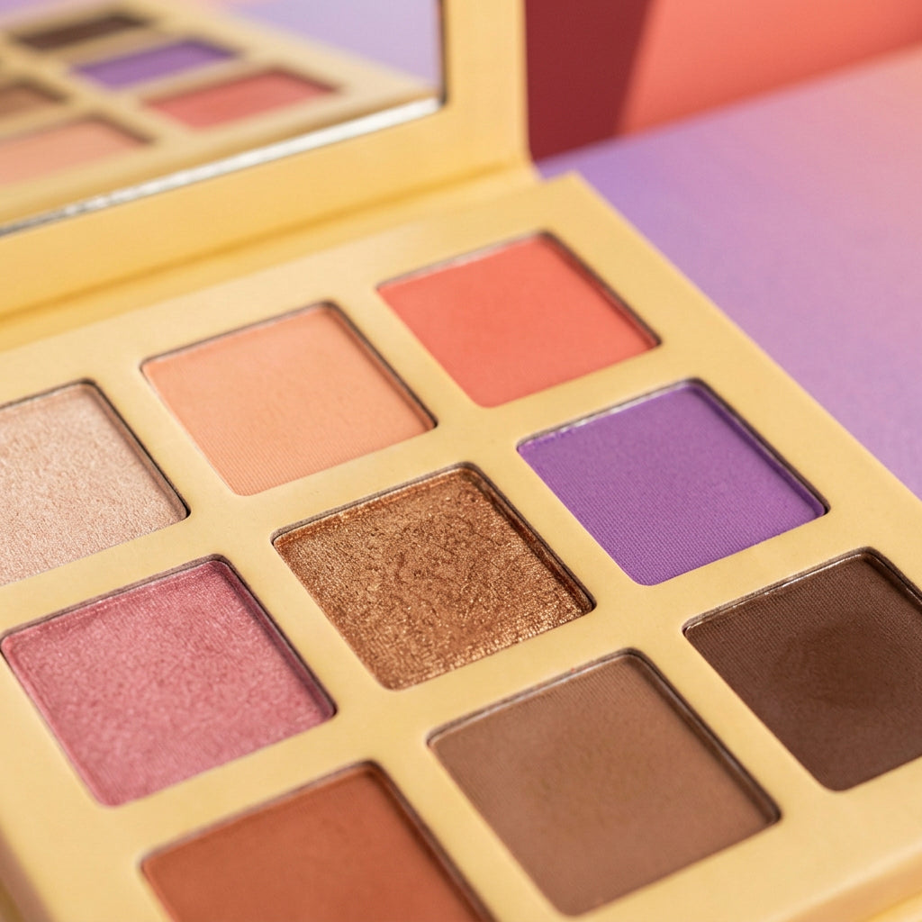
A palette becomes more interesting when its colors give you choices rather than one fixed instruction. Chromatic Muse brings light peach and champagne, warmer rose and earth tones, and a cooler purple accent into a three-by-three layout. A butter-yellow case frames the grid, while an open mirror lid lets you see the arrangement from a second angle.
The layout is orderly, but the color story is not limited to neutrals. Warm coral sits near peach; rose brings a different kind of warmth; the purple interrupts the earthier tones. You can begin with neighboring colors for a quieter direction or use that cooler accent to change the mood.

Read the Grid from Top to Bottom
Top row, left to right: a pale champagne-toned color, a soft peach, and a warmer coral. Visually, this is the lightest and brightest part of the arrangement. It introduces the palette's peach-and-sunset direction before the deeper earth tones enter.
Middle row, left to right: rose pink, bronze, and purple. This row creates the largest change in temperature. The bronze connects to the warmer colors above and below, while purple provides a cooler alternative to an entirely peach-and-brown combination.
Bottom row, left to right: terracotta, medium brown, and deep chocolate brown. These darker colors give the overall arrangement depth. They also create a visual anchor beneath the lighter top row, so the palette is not composed only of pale or bright shades.
These descriptions identify the photographed colors and their positions rather than official shade names. The grid is the useful reference: follow the location of a pan when comparing the different photographs.

Build a Color Plan Before Reaching for Every Pan
The Peach-and-Brown Direction
Start your visual plan with top-center peach, bottom-center brown, and the lighter champagne-toned pan. This creates a more restrained grouping than using all nine colors. Imagine it alongside an ivory shirt, a brown jacket, and a simple lip-color direction.
The Sunset Direction
Bring together top-right coral, bottom-left terracotta, and center bronze. These colors share warmth but differ in depth. Echo one of those tones in an accessory rather than repeating every color elsewhere in the outfit. A quieter background lets the warm grouping remain the central idea.
The Rose-and-Purple Direction
Pair middle-left rose with middle-right purple, using a brown as the more grounded companion. The cooler accent changes the balance of the palette without requiring a completely unrelated color family. Lilac clothing or a dark neutral can carry that mood into the surrounding look.
The Case Is Part of the Composition
The butter-yellow border gives each square pan its own space. Narrow dividers keep the colors distinct, and a wider outside frame separates the powder grid from the edge of the case. Above it, the square mirror lid repeats the palette's overall geometry. A plain matching carton continues the yellow color story without introducing an additional graphic.

Use the Photographs to Compare, Not to Guess
The wider views show the full arrangement and the relationship between the open case and matching carton. Closer views make the powder surfaces and yellow dividers easier to inspect. Studio light can make a surface appear more or less reflective, so these photographs should not be read as a verified chart of application finish, coverage, or wear.
Design details: nine square color pans; three-by-three arrangement; butter-yellow case; mirror lid; matching yellow carton pictured; product reference USD-EYE-003. Background blocks are photography props.
Choose a direction, select a small group of related colors, and give that group a clear visual purpose. Chromatic Muse's character comes from the space between familiar warmth and a cooler, more expressive interruption.